Overview: Serengeti Tea Company’s Ticolino single serve infuser tea sticks had gained popularity in the food service sector. The packaging redesign and creation of new branding helped position the product line for enhanced retail shelf sales. New branding was created in collaboration with the client and Marcel Eskenazy Photography, and extended to a variety of items such as packaging, point of sales display, sales sheet, and a website for lines of tea & coffee.
Challenge: The shape of Ticholino tea and coffee sticks was most important to be showcased clearly to communicate its function, highest quality product, exquisite taste, elegance, ease of use and easy disposal.
It was equally important to create a brand identity to differentiate the 12 varieties of green, black and white herbal tea and Jamaican coffee.
Market Research: Logos for tea packaging were explored. Elements of competing brand such as colors, shapes, typography and photography were noted and analyzed for visibility, brand differentiation and personality.
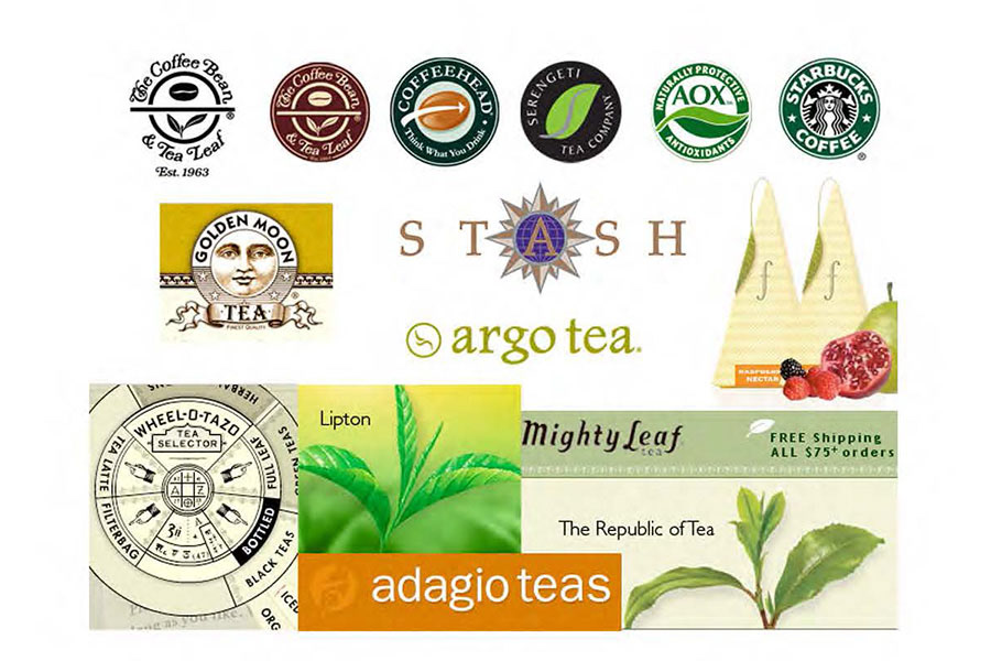
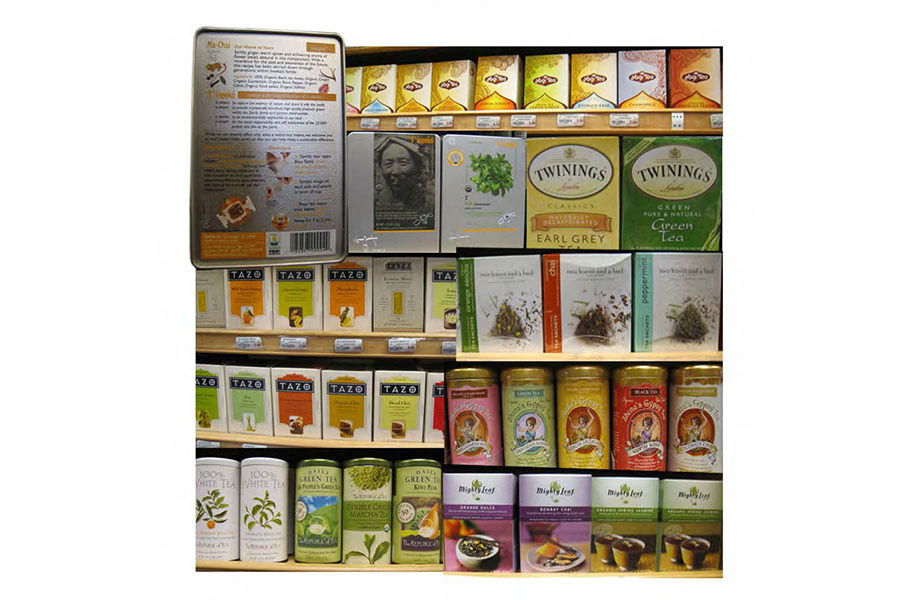
Market Research: Shelf competition and contemporary design trends were explored through logos and package designs of tea and other products as well as ethnic and international designs to understand shelf presence for product line.
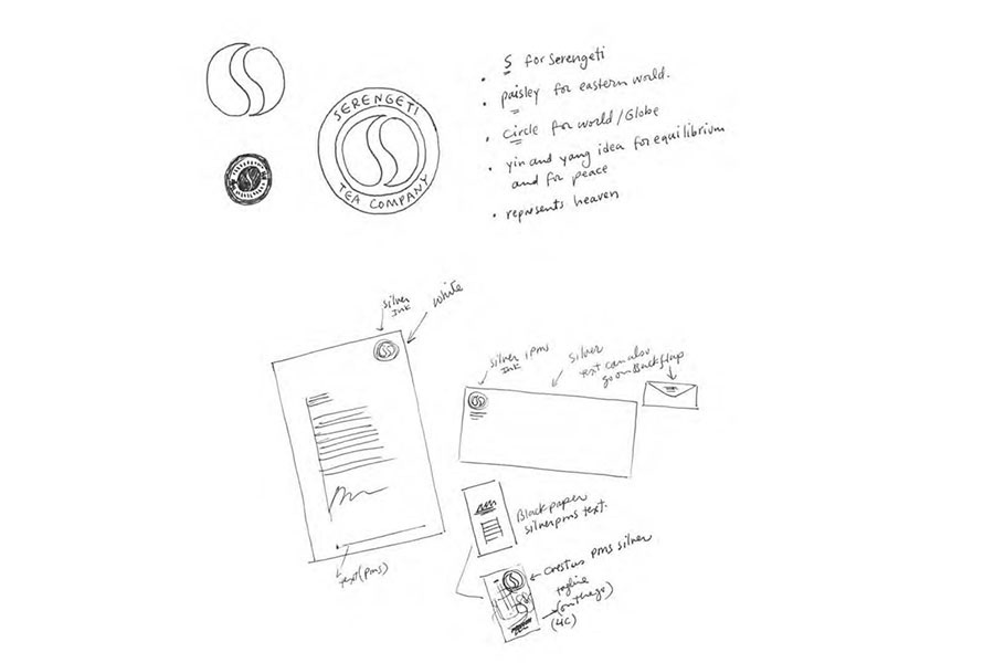
Creative Direction Logo Mark A: Design A focused on the idea of the worldliness of Serengeti Tea Company. The different varieties are imported from around the world and mostly from the East. It seemed appropriate for leaves/paisleys to be placed opposite of each other to create the shape of the letter "S" as they acted as yin and yang within a circle symbolizing the globe.
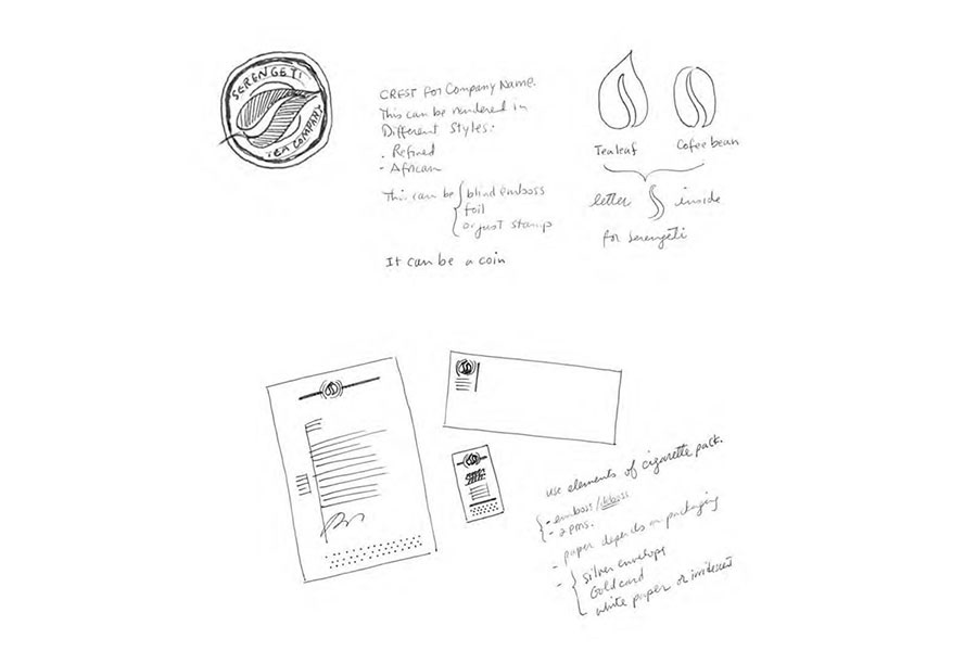
Creative Direction Logo Mark B: Design B was a crest or logo mark that could be designed in styles such as very refined or crude and African. The central image was a tea-leaf/coffee bean with the stem as the letter "S".
Stationery was using the dot pattern from the product to symbolize the infusing nature of the tea of coffee.
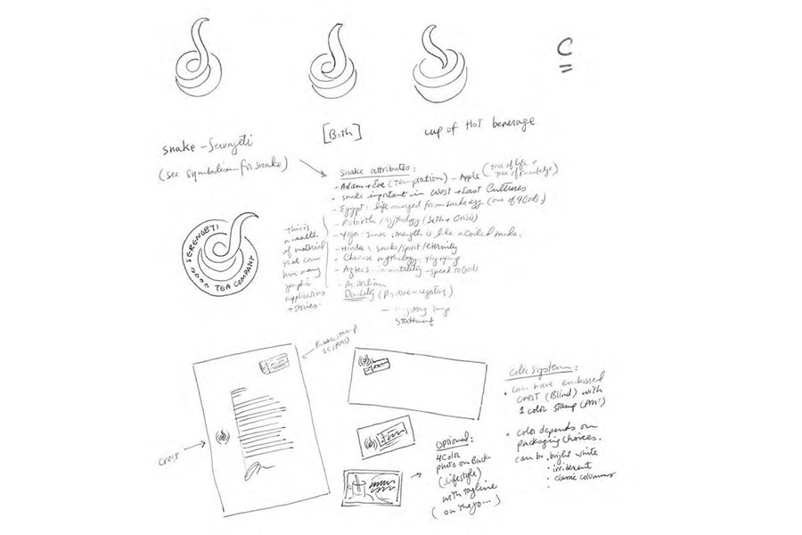
Creative Direction Logo Mark C: Design C was based on the concept of "Serengeti" and "Africa". The snake in particular was very interesting in not only having a shape that conformed to the aroma of a hot beverage, it also signified temptation from Adam and Eve and was a potent symbol in many cultures such as life in Egypt, rebirth of Seth and Osiris, inner strength in yoga, eternity in Chinese, immortality in Aztec and duality in Australia.
This international property was perfect for Ticolino as it was imported from many countries. The shape of stamp could also be used in conjunction with this logo mark.
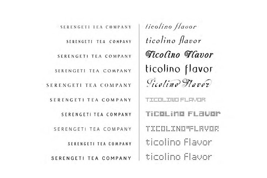
Font Search: A variety of fonts were explored to convey the essence of Serengeti and Ticolino identity and help create the appropriate image.
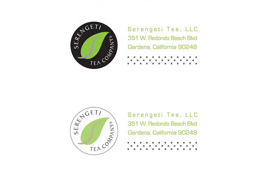
Brand Identity: Final identity mark and text took a simple and modern presentation, using a tea leaf with a silver stem as the letter "S" in the center.
Dot pattern from the product was used to symbolize the infusing nature of the tea or coffee. Eurostile font was used to create a futuristic persona.
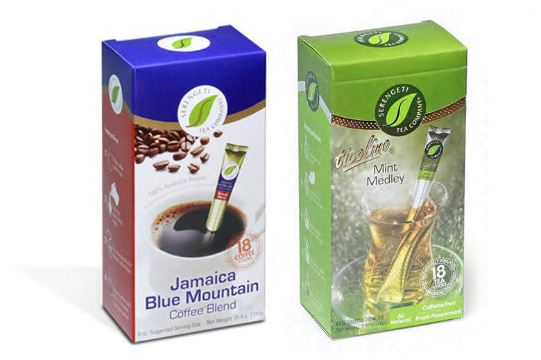
Coffee uses the same logo mark with the variation of the black circle being white, text black, and the silver stem gold.
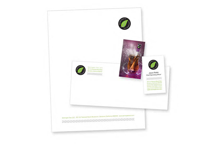
Brand Identity Design: A clean white look accompanied the logo mark and identity system. Back of the card was the actual picture of product as serving suggestion mimicking the package design for memorable effect and identity recognition.
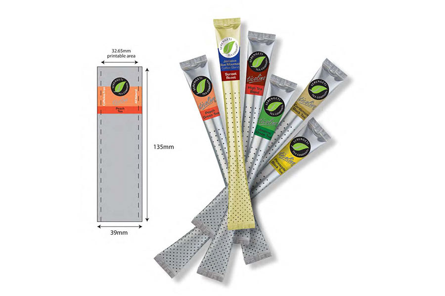
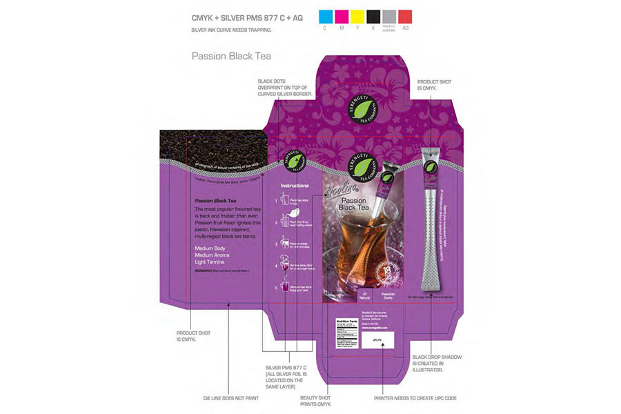
Product Design: Logo mark and typography were adjusted and applied to the die-line of Ticolino tea and coffee stick products. It was most important to maintain maximum logo and type visibility as side of the sticks would be hidden due to the three dimensional nature of the pouch structure.
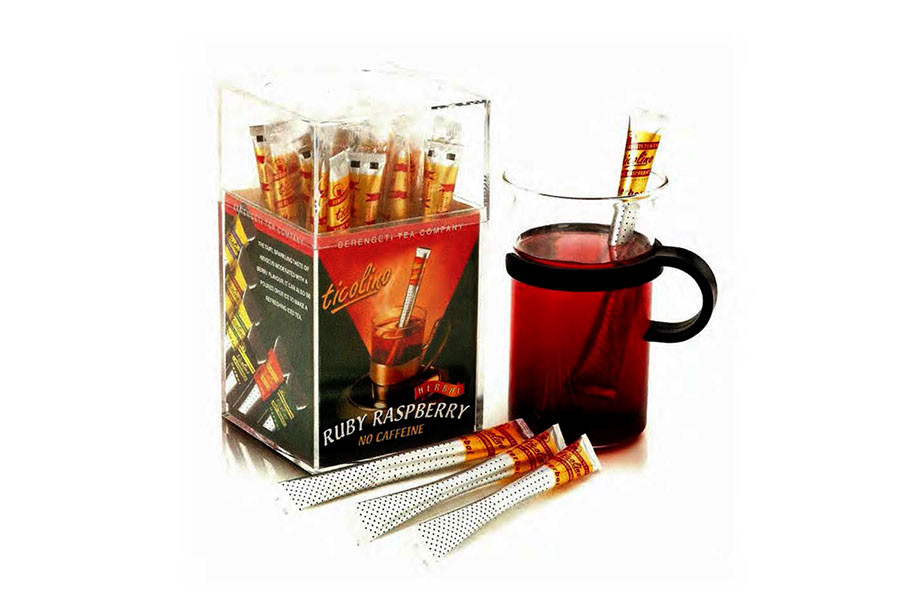
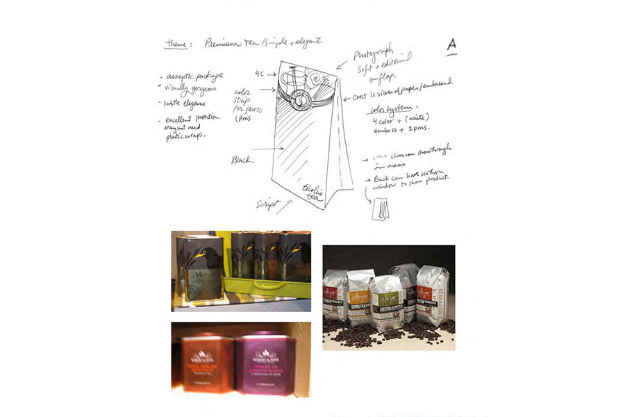
Creative Direction Package A: Package A was envisioned in an aseptic package to complement the metallic nature of Ticolino tea sticks as well as keep product fresh.
The structure was like a grocery bag with an easy to open and close flap to eliminate the need for tea stick plastic covers. Photograph of serving suggestion would be printed on the flap in four color process with white backing to contrast the foil.
The curved color strip o the edge of the lid differentiate tea flavors.
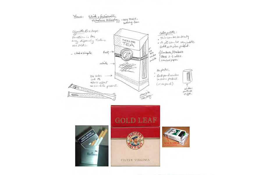
Creative Direction Package B: Package B was inspired by the shape of a traditional cigarette pack, since the tea sticks were slender and tall like cigarettes. The easy open and close flap would help keep product inside fresh and easy to dispense.
This package would have no photography on the face panel. t would have die cut holes on the bottom to mimic the pattern of the product sticks. Color would be the differentiating factor for flavor packages.
Foils and embosses and spot colors would be incorporated.
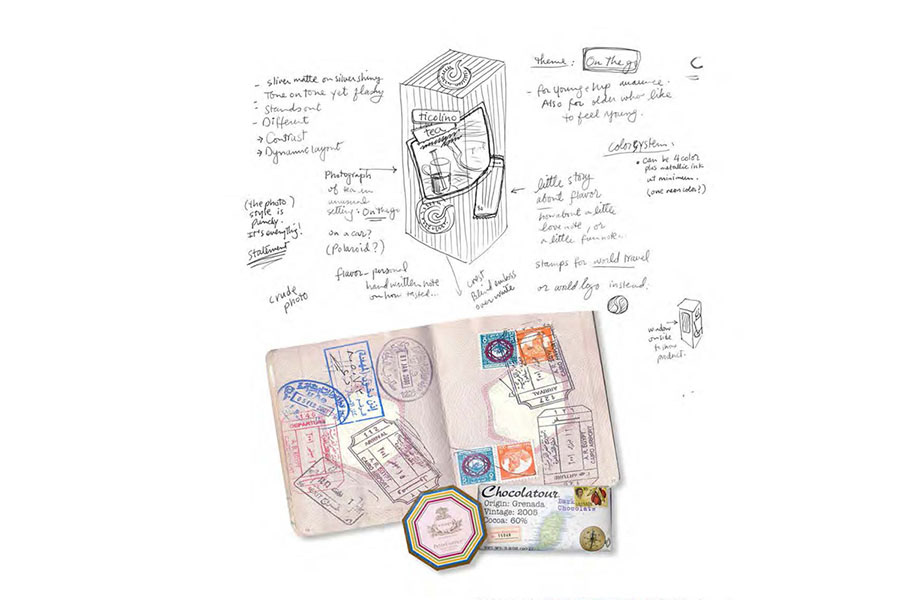
Creative Direction Package C: Package C was about travel, lifestyle and fun. Serengeti was an international product, so why not use the idea of passport stamps, a relaxing environment and luscious photography to win over the hearts of consumers?
Contrast of materials such as uncoated material with UV coated imagery would be used. elements would look as if they were randomly pasted or stamped onto the surface.
Color Strategy: Basic logo colors were black, white, green and metallic silver. Each package had two analogous added colors to set it apart.
More packages and colors were added including coffee and the substitution of gold for silver with black of the logo reversed to white.
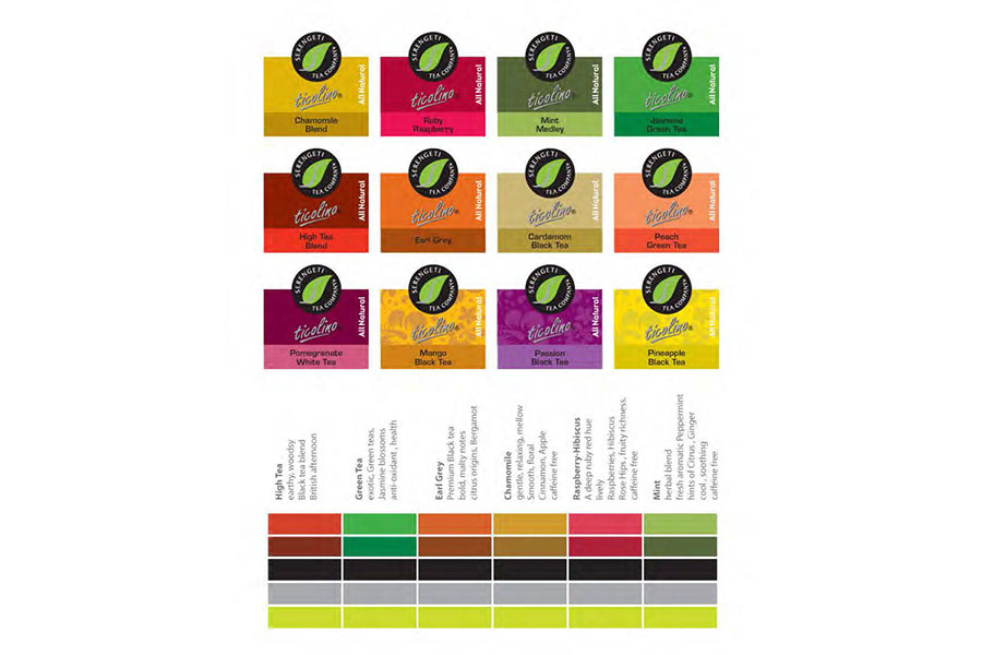
Image Strategy: Exploration of photography styles, lighting, shot angles, styling backgrounds, props, kettles and cup shapes was necessary to set the parameters for the final photoshoot.

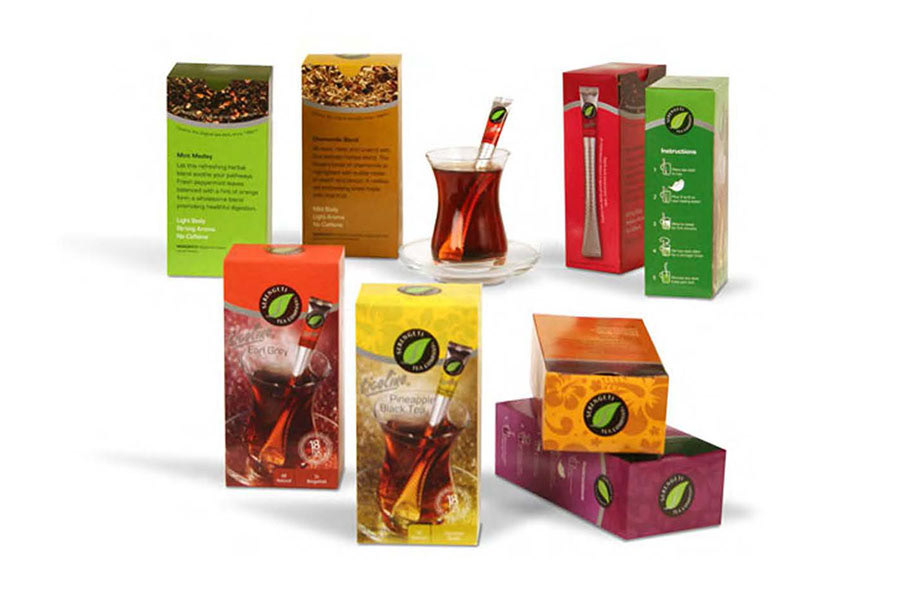
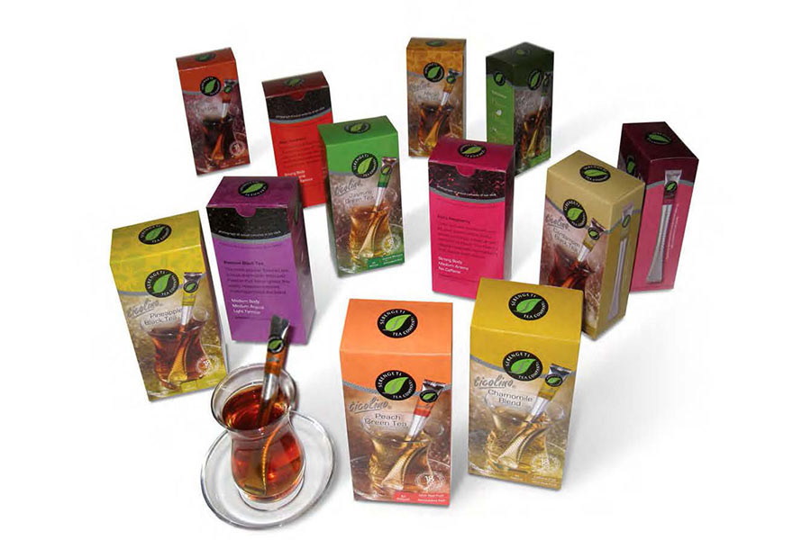
Final Packaging: Package was designed to showcase the tea stick, present tea photograph as tasteful and desirable, show actual tea particles, easily differentiate flavor varieties, and communicate instructions.
Curved silver metallic ink with over printed black dot pattern wrapped around the package as the tea stick theme.
Final Packaging: Final package designs stood out on the shelf against competition as a unified brand. The variety of flavors were clearly distinct through careful design of color palette. Information was clearly and tastefully showcased for consumer attraction and ease of understanding.
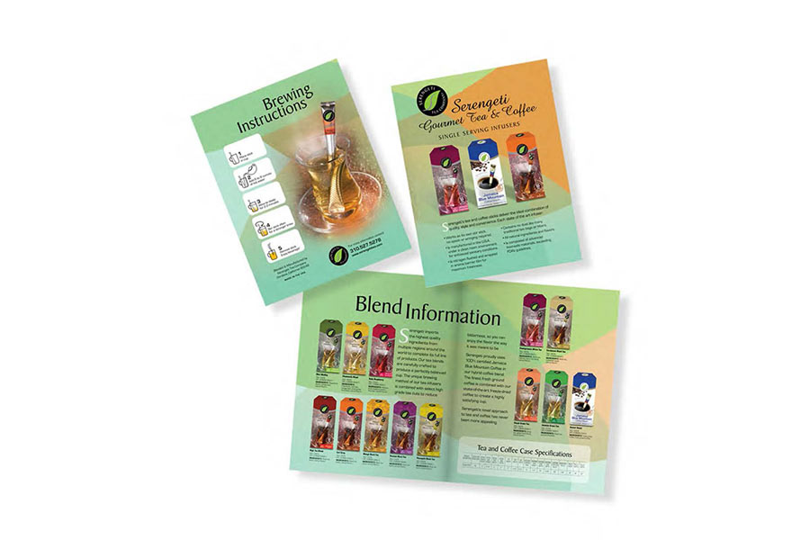
Point of Sales: Double-sided tabloid size layout was designed to fold in half and create a four-page presentation of Tocolino tea and coffee varieties including usage instructions.
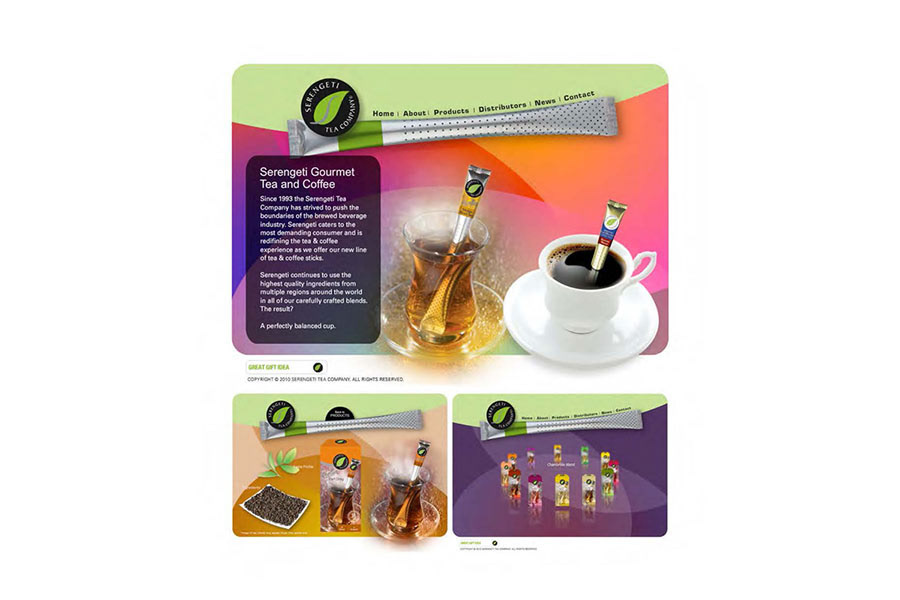
Web Design: Dynamic website was designed in Flash to feature moving steam, round carousel of tea variety packages and various ingredients and imagery. Navigation followed the contour of a Ticolino tea stick.
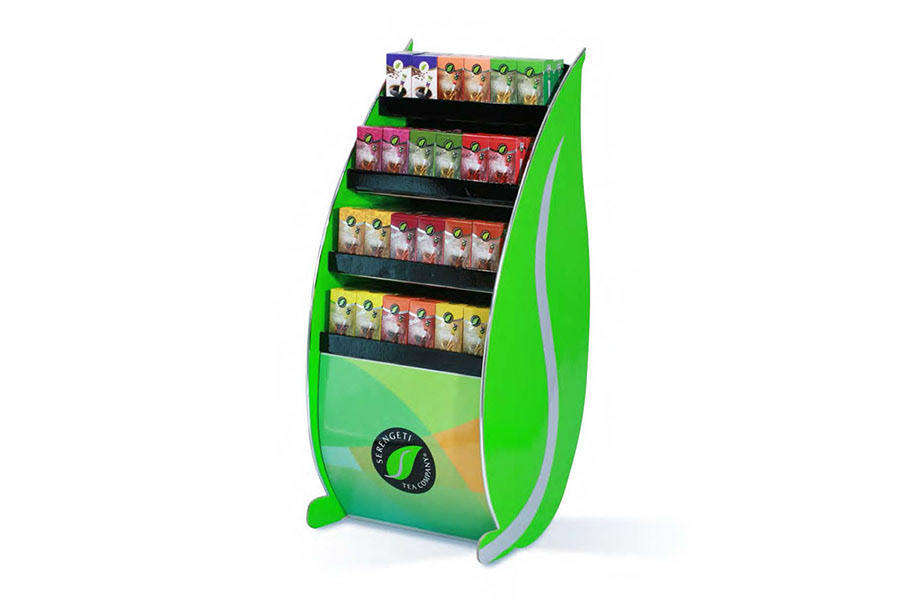
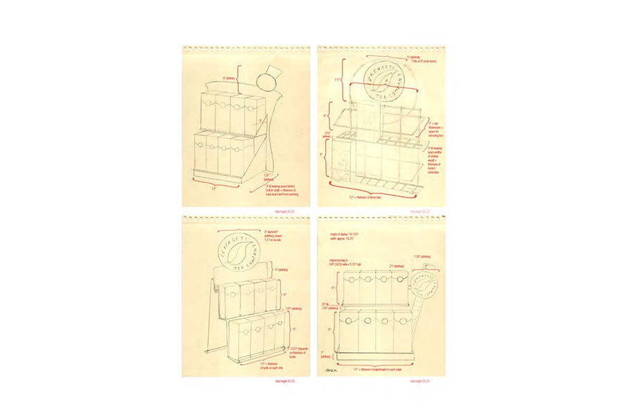
Creative Direction Point of Purchase Display: A variety of metal frame structures with chip board logo mark were explored for design of Point of Purchase Display. (Illustrations done by Arpy Tarpinian.)
Final Point of Purchase Display: Packages were showcased for individual tea stick sales of various flavors.
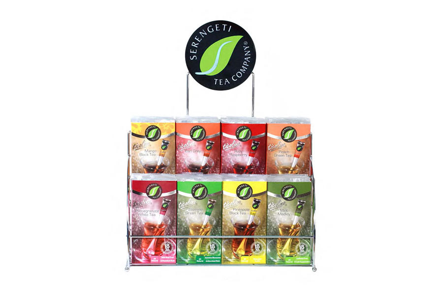
Final Point of Purchase Display: Design of floor display was revised based on an existing die-line from manufacturer located overseas. Design direction to alter structural die-line and input graphic design files appropriately was conducted through online communication,