
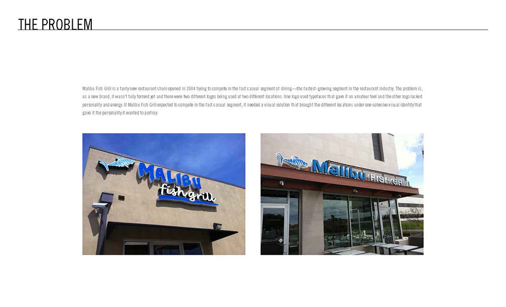
The Problem: Malibu Fish Grill is a fairly new restaurant chain opened in 2004 trying to compete in the fast casual segment of dining—the fastest-growing segment in the restaurant industry. The problem is, as a new brand, it wasn’t fully formed yet and there were two different logos being used at two different locations. One logo used typefaces that gave it an amateur feel and the other logo lacked personality and energy. If Malibu Fish Grill expected to compete in the fast casual segment, it needed a visual solution that brought the different locations under one cohesive visual identity that gave it the personality it wanted to portray.

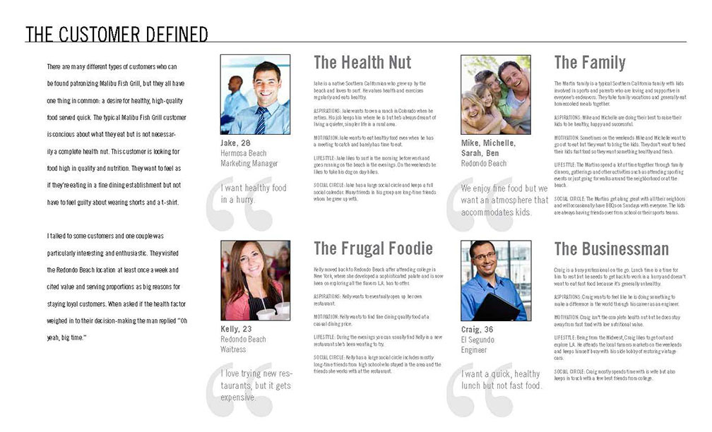
The Customer Defined: There are many different types of customers who can be found patronizing Malibu Fish Grill, but they all have one thing in common: a desire for healthy, high-quality food served quick. The typical Malibu Fish Grill customer is conscious about what they eat but is not necessarily a complete health nut. This customer is looking for food high in quality and nutrition. They want to feel as if they’re eating in a fine dining establishment but not have to feel guilty about wearing shorts and a t-shirt. I talked to some customers and one couple was particularly interesting and enthusiastic. They visited the Redondo Beach location at least once a week and cited value and serving proportions as big reasons for staying loyal customers. When asked if the health factor weighed in to their decision-making the man replied “Oh yeah, big time.”
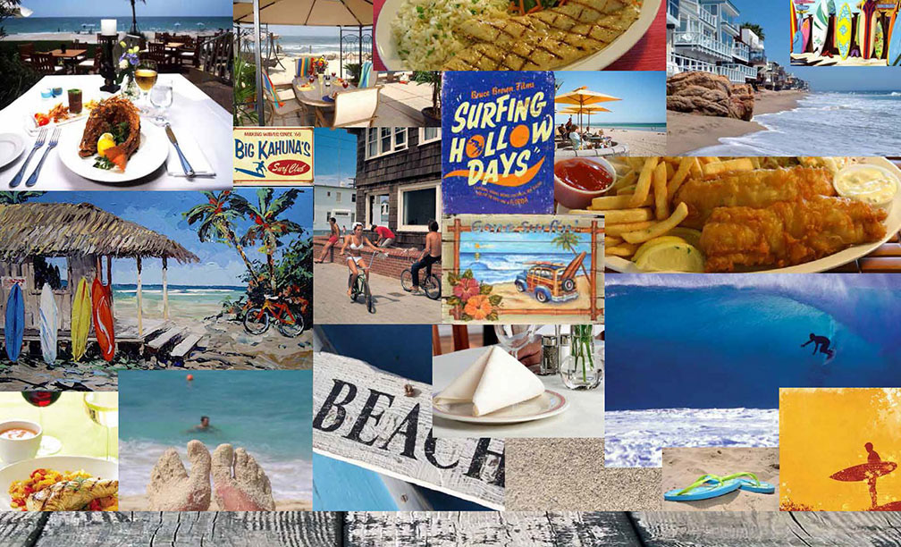
The Personality Defined: Malibu Fish Grill strips away the dim lighting, white tablecloths, silver dessert forks and snooty waiters and leaves the most important part: the food. Now the daily fresh fish found on the menus of fine dining establishments can be enjoyed every day in a casual atmosphere. Malibu Fish Grill is the passionate fishmonger with a surfer’s laid-back attitude bringing the freshest seafood to the masses with a smile.

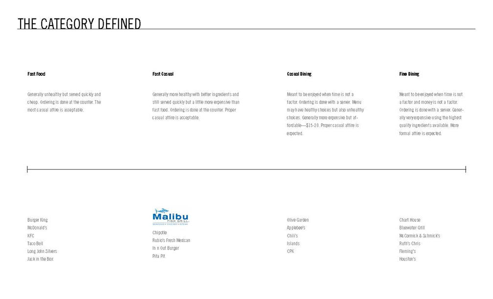
The Category Defined: Fast Food, Fast Casual, Casual Dining, Fine Dining
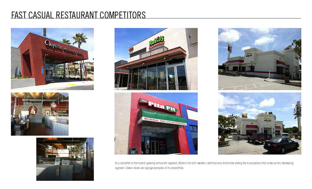
Fast Casual Restaurant Competitors: As a competitor in the fastest-growing restaurant segment, Malibu Fish Grill needed a look that was distinctive among the many options that make up this developing segment. Shown above are signage examples of its competition.
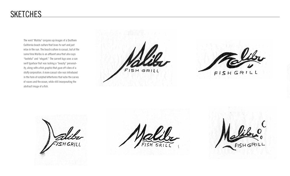
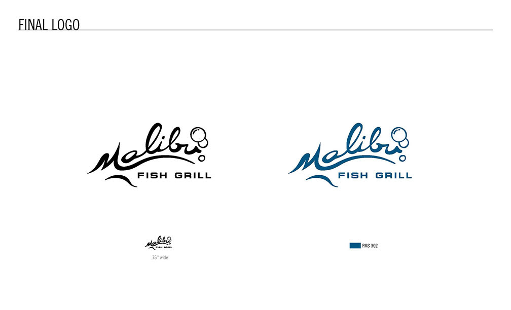
Sketches: The word “Malibu” conjures up images of a Southern California beach culture that loves to surf and just relax in the sun. The beach culture is casual, but at the same time Malibu is an affluent area that also says “tasteful” and “elegant.” The current logo uses a san serif typeface that was lacking a “beachy” personality, along with a fish graphic that gave off vibes of a stuffy corporation. A more casual vibe was introduced in the form of scripted letterforms that echo the curves of waves and the ocean, while still incorporating the abstract image of a fish.